
A.5 Appendix: Common Size Analysis
Introduction
The major purpose for preparing
financial statements is so users can extract useful
information from them about a company.
The first step is to understand how financial
statements are constructed and what the various line items
mean. This was
covered earlier in the introduction to financial statements.
In this topic we explore a technique designed to let
users extract additional information from the financial
statements.
This technique is referred to as common size analysis.
Common size analysis re-expresses an entire financial
statement relative to a single item referred to as the “base
item.” Typical
base items are Total Assets and Revenue for general
purposes, but the depending upon the purpose many other base
items are relevant for specific purposes.
Common size analysis creates a simple ratio between
every item on the financial statement and the selected base
item. Ratio
analysis provides a refinement of common size analysis
designed to extract and summarize additional information
relative to key categories such as profitability, risk,
solvency and liquidity.
Vertical and
Horizontal Common Size Analysis
There are two types of common size
analysis, vertical and horizontal.
Vertical
analysis restricts common size analysis to one reporting
period and typically focuses upon the composition within a
report. For
example, vertical analysis provides immediate insight to
users regarding asset, financing and cost structures within
a firm.
Horizontal analysis
applies common size analysis to focus upon trends and
changes over time.
For example, how has a firm’s gross margin changed
over time?
Both vertical and horizontal common
size analysis can be further extended to comparing across a
set of competitors or other firms to tease out additional
information. As a
result, common size analysis is an important tool that is
immediately applicable to the financial reports.
Valuation Tutor lets you work
interactively and visually with the financial statements
provided to investors in a 10-K, 10-Q, and 20-F.
This is a powerful tool lets you take common size
analysis to new heights permitted by today’s technology.
This tool allows for the common size analysis of any
of the latest as well as past interactive statements so that
easy comparisons can be made over time and among immediate
competitors or other stocks being screened.
This ensures that you are extracting timely
information from these reports that can be compared to
responses in the stock market after the reports are publicly
disclosed such as in “earnings’ season.”
The opening screen appears as follows:
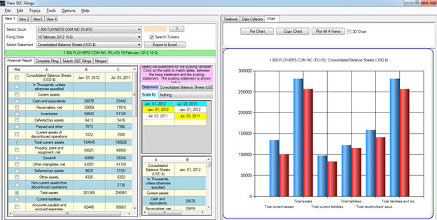
The top LHS of the screen is where you
enter the ticker and select the statement you want to apply
common size analysis to.
The bottom LHS of the screen is the statement you
have selected to apply common size analysis to, the center
part of the screen is the base variable that you select to
scale by (which can come from another statement) and the RHS
of the screen is the results of your graphical analysis.
First we consider the default
Consolidated Balance Sheet and scale it by Total Assets.
We then extend this analysis to the Income other
statements.
Common size Analysis
of the Balance Sheet
The common size analysis of a balance
sheet can immediately highlight some important issues such
as:
What is the composition of assets (real
versus financial assets)?
What is the financing composition (debt
versus equity)?
How does the asset composition change
over time?
Has the financing composition changed
over time?
What does a strong versus a weak
balance sheet look like?
Vertical analysis provides answers to
the first two questions and horizontal analysis provides
answers to the second pair of questions.
Combined, both forms of analysis provide some
relevant information for the last question.
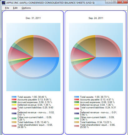
Example:
Common Size Analysis using Total Assets for Apple
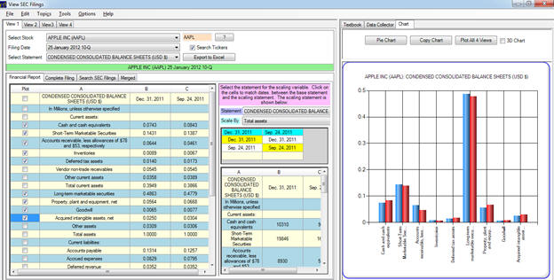
In the above screen a common size
analysis of the January, 2012 balance sheet for Apple is
provided scaled by Total Assets.
The LHS of the screen provides the results of the
analysis and the RHS of the screen presents these results
graphically.
A few immediate observations jump out.
First, the relative importance of Property, Plant and
Equipment to Apple is not large.
This reflects the fact that manufacturing hardware
such as the Apple iPhone is outsourced.
The relative importance of Financial Assets is
immediately clear.
The big spike is “Long term marketable securities.”
In general the asset composition is a much greater
emphasis upon financial as opposed to real assets for Apple.
Furthermore, this is an increasing
trend over time.
For example the relative percentage of total assets
for PPE is declining, because Apple’s financial assets are
growing. This
is especially the case for investment related financial
assets however Apple’s working capital assets, such as
inventory and accounts receivable, are also growing.
This reflects the current growth and the expectations
for immediate future growth.
The composition f liabilities for Apple
also reflect strength.
Apple has no debt and the composition is heavily
skewed toward current liabilities (long term liabilities are
approximately 10% of total liabilities).
Compared to Total Assets Apples total liabilities
are low, less than 40% implying that the stockholders’
equity is relatively large (65%).
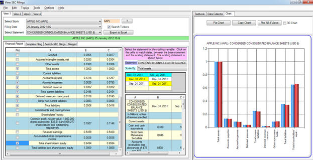
The composition can be decomposed to
reveal greater detail in a more traditional pie chart
How does Apple compare to Intel, a
manufacturer that does not rely heavily on outsourcing?
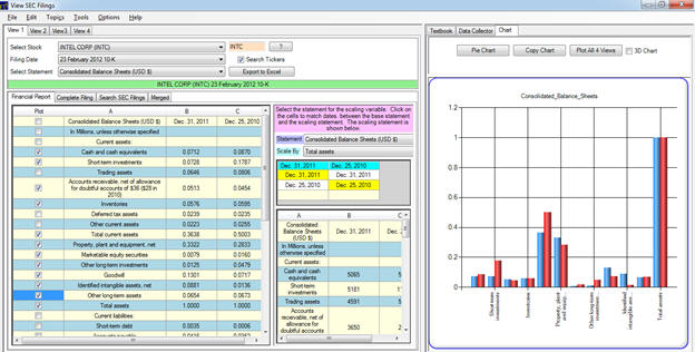
Immediately the difference for real
assets is apparent.
Intel’s PPE has increased from 28% to 33% in contrast
to Apples decrease to 5.6% from 6.7%.
This reflects the fact that Intel manufacture in
their own plants.
Similarly, on the liability side investment in real assets implies the financing decision is more important to Intel than it is to Apple.
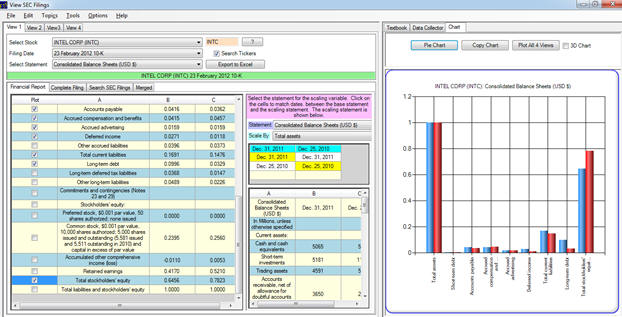
The relative % of Owners Equity has
declined for Intel to just over 60% from a very high 78%
which is largely due to the additional long term debt
financing taken on over the last year – presumably to take
advantage of the very low rates currently available to fund
its increased investment in real assets.
Example:
Common Size Analysis using Revenue for Apple
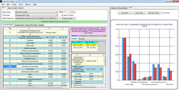
Common size analysis applied to Apple’s
2012 10Q reveals the strength in earnings for this company.
First, Gross margin, Operating and Net Income have
all increased.
Every cost category has declined with the exception of
provision for taxes which understandably increased.
Apple’s Gross Margins are large and
growing (45%, 35% respectively for 2011, 2010 December
quarters).
Example:
Common Size Analysis of the Cash Flow Statement for
Apple
Common size analysis of the cash flow
statement provides additional insights into the Operating,
Investing and Financing activities of the firm.
For example, scaling these activities by Net Income
reveals that Apple is achieving large amounts of growth
without increasing their investments:
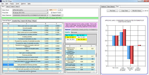
However, the Cash Flow from Operations
as a % of Net Income is declining which raises the
interesting question why:
Why has Apple’s Cash Flow from
Operations relative to Net Income declined
significantly?
Graphically you can observe this from
the RHS plot relative to the LHS plot (which is Net
Income/Net Income = 1).
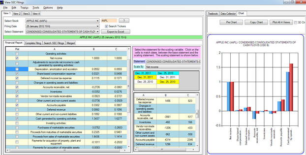
To clarify this consider scaling both
cash flow statements by the net income for the 2010 quarter.
This is achieved by selecting both 2010 statements
circled below:
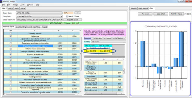
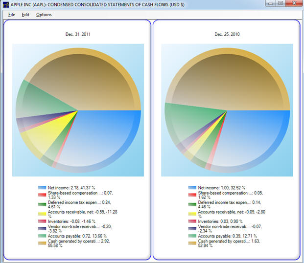
Now all is relative to the 2010 Net Income. This common size analysis immediately reflects the strong growth Apple is currently experiencing. That is, the increase in December quarter’s net income was 218%! Common size analysis immediately reflects how each category has grown relative to Net Income. This reveals that along with this rapid growth Apple was positioning itself for even stronger growth especially with respect to the working capital items such as Inventory, and accounts payable. Also reflective of the quarter’s realized growth was the sharp jump in accounts receivable. Combined these working capital items implied that the rate of increase in net income greater than the rate of increase in cash flow from operations. The pie chart depicting composition makes this clearer:
In the above scaled by 2010 Net Income
the growth in Net Income for the same quarter 2011 was 218%
but the growth in cash generated from operations is
2.92/1.63 = 179%.
This is largely driven by Accounts Receivable jumping
from -2.80% to -11.28% (i.e., a use of cash), Inventory
jumping from 0.90% to -1.46% (a use of cash) and Accounts
Payable increasing from 12.7% to 13.7% (a use of cash).
These jumps when growth is strong indicates the
expectation of even stronger growth to come.
Exercise:
Apply the Valuation Tutor to the 1st
quarter of 2012 to further check these trends.